
Anomaly Detection in Quicksight is an ML-powered advanced feature that helps identify outliers and unseen trends across millions of records of data in a continuous phase. You can gain deep insights from this anomaly detection that are frequently hidden in aggregates and impractical to scale with manual analysis. In most cases, when you are using the date dimensions on your visuals, Quicksight automatically identifies these outliers and shows them with a bulb icon in the menu on the right-hand side of the visual.
Creating Anamoly Detection
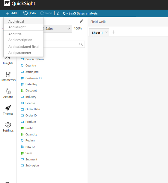
- Select the add button from the top left corner, then, click add insight in the drop-down to add a new insight visual in the analysis panel which also open up the computation pop-up
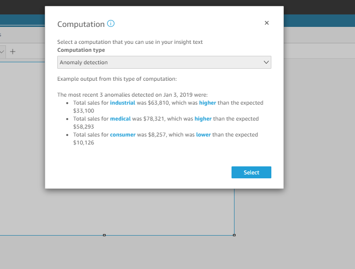
- In the computation pop-up, you will have a list of computation type to choose from a drop-down. Select the anomaly detection option and click the select button to apply it to the insight visual.
- Once you do that, In the Filed well, you need to choose the appropriate field for time, values, and categories. In my case, in the following picture, I have selected order_date for time, order id for values, and products for categories.
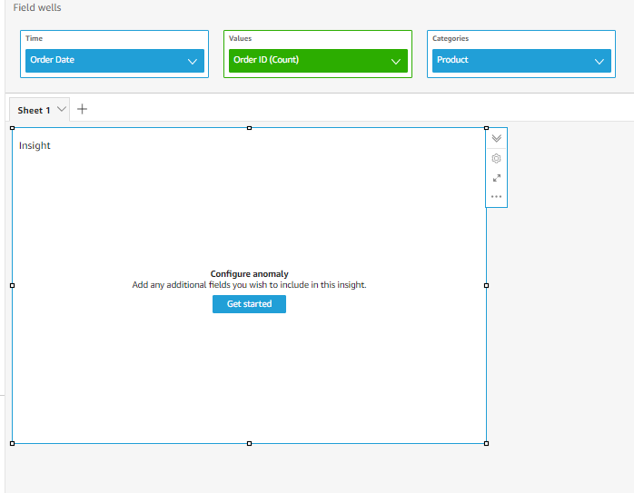
- After you added the field well, select the Get started button in the visual and that will open up a page where you can configure the anomaly detection. The page would look something like the below.
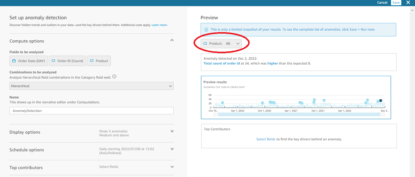
- Now, since the selection of the Product category is all, it finds out the anomaly value for the entire product. To spot the anomalies for individual product categories, you can simply click the drop-down to choose the preferred category. Once you have chosen one of the categories, the preview result changes and shows you the anomaly for the selected category.
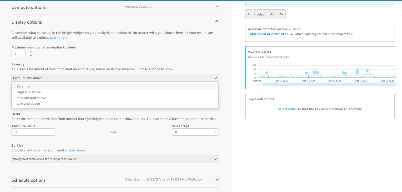
- Display options: In this section, you can customize the anomalies if you are aware of what an anomaly value would be for your data.
- The maximum number of anomalies to show, allows us to set how many anomalies it should show in the visual.
- The severity section categorizes the anomalies into four parts very high, high and above, medium and above, and low and above. Based on your selection the preview result changes the anomalies in the visual.
- Directions help us to track down the unexpected spikes and dips in the visual with Lower than expected and Higher than expected as options
- Delta has two options absolute value and percentage. If you are aware of the anomaly value in your data, you can set that value under absolute value, and percentage.
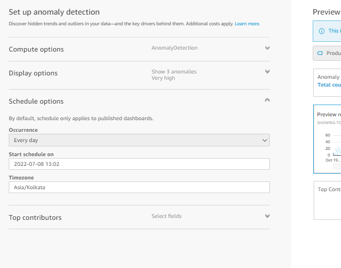
- In the Schedule option, you can set how often the model should run to find out the anomaly. You will also have options such as every day, weekly and monthly to schedule and the option would look something like the below
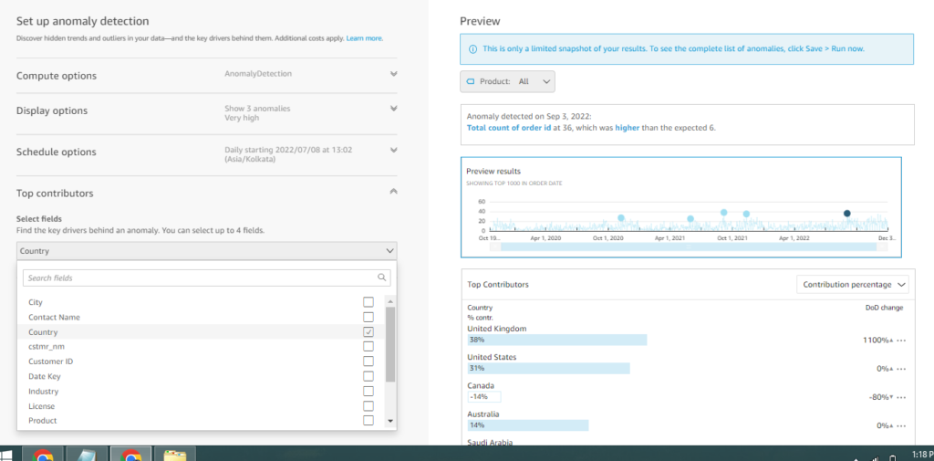
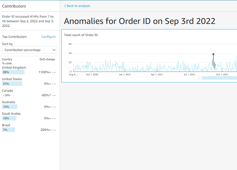
- Top contributors: It allows you to choose other field categories from the same dataset to find out which of its field category is contributing the most to the anomaly. In my case, I have selected the country field and I can see on the right side which country is contributing the most to the anomaly.
- After setting the customization, you can click the save button on the top and then click the run button in the visual. Now all your customization will be applied and would run through the model to give you the ideal anomaly on your visual. The final visual would look something like the one below.
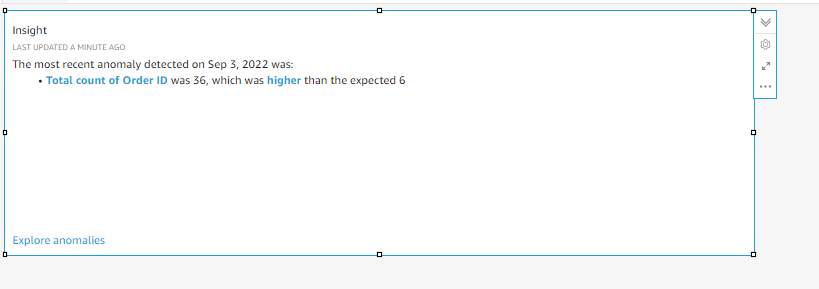
Explore anomalies at the bottom of the visual helps us to see the anomaly in detail. In addition, it also allows us to choose the fields from the dataset to find out the top contributors to the anomaly. The following picture is a reference to the page.
With a few clicks of a button, we can identify the outliers in the data and it doesn’t require any other external technical expertise. Hope the explanation helps you better.
Learning is what makes me excited. I have a handful of experience as a data and BI analyst with broad skills across various tools. I am also a person who take up challenges and who work for it untill it get resolved. I have learnt to be spontaneous and precision in problem solving because of the experience over the years.